How to conduct a UX audit in the beauty industry? UX audit step by step
Selling cosmetics online has great potential, so we looked at several stores in this category and analyzed the trends occurring in the beauty industry. In this article, Agata Chmielewska and Radek Rejsel share specific tips to help you increase sales in online drugstores.

According to a report prepared by Gemius for the Chamber of Electronic Commerce, cosmetics have been one of the three most frequently purchased product categories online for several years now.
Furthermore, those who don't currently shop online indicate they might start buying these products online in the future. This demonstrates the potential this industry has to reach new customers and increase sales.
How to ensure the best experience at all stages of the purchasing journey?
Since consumers are looking for information about cosmetics and perfumes online (according to data from the E-commerce in Poland 2022 report), beauty brands and stores should strive to provide the best possible user experience at all stages of the shopping journey. This applies to both the information search phase and the product selection phase, ending with the process of closing the transaction. All these stages are influenced by various factors, but in order to be able to indicate which ones require optimization, it is worth carrying out audyt UX.
What is a UX audit?
A UX audit involves the analysis of a website, online store or other digital product, the purpose of which is to evaluate that product in terms of user experience. It consists of expert evaluation and analysis of data collected from tools monitoring user behavior such as GA, HJ, etc. This allows to identify obstacles in the transaction path, as well as to indicate elements for improvement.
Often, the UX audit is extended to research with potential recipients in the form of interviews and observation of how they perform specific tasks on the site. This helps to collect a complete picture of the problems and causes that users are facing.
Of course, the audit is only the first step. In itself, it will not change anything, it is necessary to implement recommended changes, eliminate registered errors and further monitor the functioning of the site.
In the case of online stores, we usually perform a UX audit to find ways to increase conversions or decide to redesign the entire store if the layout deviates strongly from common standards.
UX audit in cosmetics stores
UX auditing in ecommerce does not differ much from industry to industry. There are small differences due to the specifics of the customer, who pays attention to different things and so, for example, in beauty shops the appearance and aesthetics of the store can be more important than in a store with products for builders.
When conducting a UX audit, we always pay attention to:
- desain, that is, the overall look and style of the site,
- transparency, that is, readability and easy understanding of what I find on the site,
- credibility, that is, instilling confidence and a sense of security,
- functionality, that is, intuitiveness, simple movement on the site and a trouble-free transaction process, that is, the realization of the goal.
These elements, combined with promotional activities and customer service, create a complete customer experience. Therefore, we always encourage you to analyze all the wastewater that the customer passes through. This path begins with the first contact with the brand, e.g. advertising on social media, through activities in the store (product search, shopping cart process, etc.), as well as post-transaction service (delivery or contact with customer service).
Let us now go through some examples of audits that we conducted for Polish online drugstores. We have gathered the conclusions from them into joint thematic groups. These audits were carried out on the basis of the expertise of our team, without access to analytical and sales data and without research with users.
First Impression — Overall Look and Style
As we mentioned before, in the beauty industry, the aesthetics of the store can make a difference. The motivation of customers to buy is often to improve their own appearance, preserve health and freshness.
The first contact with the site should evoke positive feelings, make the user feel that he is in the right place. Let's try to avoid a sense of chaos, information overload and ambiguity. Of course, the aesthetics of the website is important not only in online drugstores, but here it supports even more to build credibility and meet the needs of taking care of your own body.
Why is aesthetics so important to us? This is related to the so-called aesthetic utility effect. According to him, people perceive aesthetic designs as more useful. This applies to both the appearance of the site and the packaging of the products. In other words, we are simply able to forgive nice-looking websites more, and in addition, the products presented in it seem to work better.
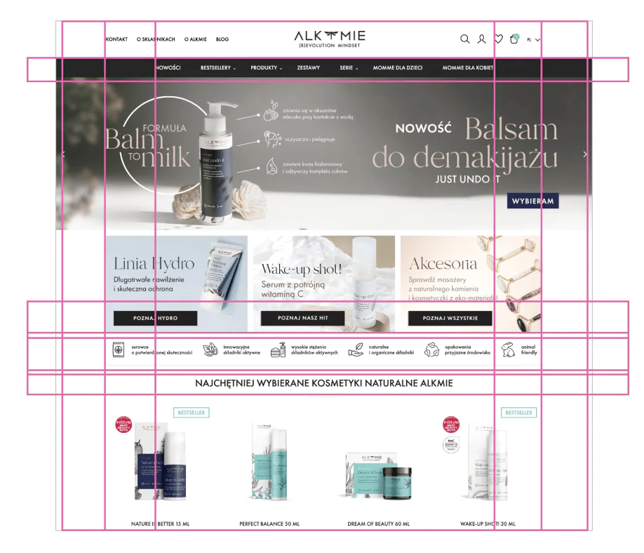
How do you feel when you look at Alkmie.com? Do you also have the impression that it is difficult to determine which element is the most important? The gaze jumps all over the side, you don't know what to focus on, and the whole thing is a little overwhelming. The structure of the page is also disturbed (the margins of the page and the distances between the different elements are unclear) and it is difficult to quickly tell what belongs to what. The black navigation bar with product categories does not help here, which adds even more weight to the page and dominates it. It distracts attention from the elements that should first attract the eye when entering the site, that is: CTA or USP (Unique Selling Propositions) buttons.
Black color can often be associated with luxury and is willingly used by brandies who want to position themselves as premium. The question is, does color really matter?
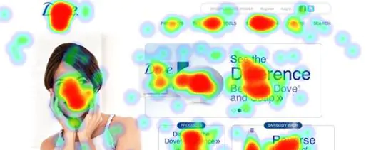
Yes, and in the case of cosmetic brands, this is confirmed by studies conducted by the Dutch startup Usabilla.
They showed what attracts users' eyes and what power color has in building positive consumer feelings. For example, Dove's blue and white color scheme evoked freshness, purity and youth. This is what we expect from cosmetics.
We mentioned above about Call to action and USP. The latter are in a way a brand promise and support to create in the site visitor a sense that this site will meet my needs. This feeling can be obtained in many ways, however, the most common and simple is simply a banner in the first view of the screen, which answers the questions that arise in the consumer's head. Can I find products for myself here (e.g. specific brands, products)? Does the store support the values to which I am committed (e.g. caring for the environment)? How is this store better than others like it (e.g. low free delivery threshold, cosmetics samples)?
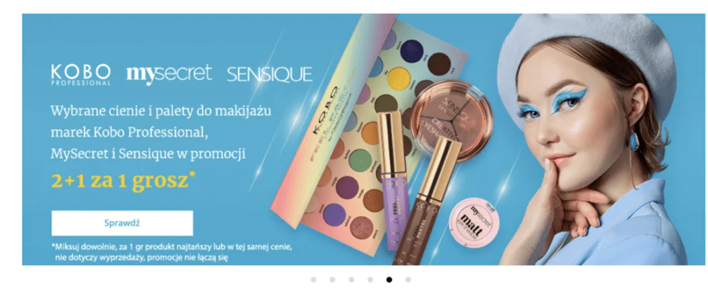
We would like to say that in the first view of the screen, on such a main banner, we do not need to inform at all about promotions, sales, etc. However, for many years, financial aspects have been one of the main factors motivating Internet users to make purchases.
Drogeria Natura, of course, knows this and informs on the main page about current promotional actions. However, is he doing it the right way? In our opinion, not necessarily, because the amount of elements and text on the banner disturbs the aesthetics and does not say clearly what the user will receive. The slider changes the graphics view so quickly that before we get to the relevant information: “2+1 for 1 penny*”, we already see another banner, on which a lot is also happening.

The transparency of the website, i.e. readability and easy understanding of what it offers, and at the same time the lack of information overload makes the website look professional and inspires more trust in us.
Readability is also the size of the texts on the page, as well as the arrangement of its individual elements. So let's not tire customers with too small texts and do not force them to wonder which button to click. Let's remember people with various disabilities, such as visually impaired people, for whom small text will simply be unreadable.
Readability is also to facilitate text scanning through good formatting: bold the most important words or short phrases, creating lists, underlining. If we bold entire sentences or entire paragraphs (Alkmie.com example below), it will lose its meaning.
The importance of content in the beauty industry
The product page and the content on it have a huge impact on the purchase decision. When looking for information about cosmetics, customers pay great attention to detailed descriptions of the operation of products, good photos and opinions of others. Additional materials such as tutorials or videos are also important.
This is related to the fact that they cannot take the product in hand, check its consistency, read the description on the packaging or ask the seller about the product.
It is also worth adding to the product description the compositions of cosmetics, both active ingredients and their chemical counterparts, i.e. InCi compositions, because this is what consumers expect, transparency (according to the article. Deloitte research).
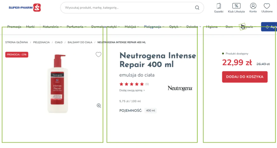
In addition to the content itself, its structure and hierarchy of information are also important. In the following example from the Super Pharm drugstore, we can see that the 3-column layout of the product page gives the impression that the page is running away, it is difficult to cover it visually, and a lot of empty space causes the user to overlook important elements (e.g. the button to add a product to the cart).
How do we know what we should put on the product page? A great guide was prepared by Katie Sherwin from Nielsen Norman Group, in which we see that not only the photo and the description matter. The product card also provides useful shipping information or instructions on how to use, which is especially important in the beauty industry.
It is also a good practice to publish more photos or videos about a given product. You can show on them the packaging from different sides, the consistency of the product, and in the case of colored cosmetics such as a given eye shadow or lipstick, it looks on the face depending on the skin tone. It is always worth asking the manufacturer about this type of materials, because perhaps he has them in his database and will be happy to share them.

Another important element of the product card is the opinions of other customers who have already used the product. We know that getting feedback is not a simple task, but worth the effort, because as they show surveys Other people's experiences are of great importance when making purchasing decisions, especially in the beauty industry. For example, one study found that adding at least one product review can generate up to 65% increase in sales. However, keep in mind the Omnibus directive that came in this year and that requires e-store owners that opinions only come from people who have actually used the product in question.
You can also try to collaborate with influencers who will test selected products and share their impressions on their social media or other communication channels. Also put their reviews on the tabs of the tested products.
While we are on the product pages, we will touch on another very important issue: information architecture. Unfortunately, it was disturbed in many places in the online drugstores we audited. Disrupted information architecture can cause the user to have trouble distinguishing individual elements on the page, finding some information, or even missing the add to cart button.
A common problem is also the structure of the product listing architecture, where the products are very close to each other, or there is a lot of white space between the individual elements of the product tile, which creates chaos (Alkmie.com example). In addition, the lack of clear intervals between products makes it unclear which information belongs to one product and which belongs to another.

The readability of the product listing is also disturbed in Drogerie Natura, where, as in the previous example, there is no clear separation between product tiles, and in addition we have lines separating individual elements inside the tile, which causes additional confusion.
Here we still have a disturbed hierarchy of product information: Brand > Fragrance > Product Name, and should be Product Name and Brand > Fragrance. All this, in effect, means that when scrolling, you lose track of what product the information is about.
In-store functionalities — intuitiveness and simplicity
Thanks to technological capabilities, customers can feel in online stores almost the same as in stationary stores. There are countless functionalities that make it possible to immerse yourself more in the product and learn more about it. But let's start with the basics, and we'll move on to more innovative solutions later.
Search engine:
should be conspicuous on each subpage (maybe outside the basket),
- should be conspicuous on each subpage (maybe outside the basket)
- should take into account typos and synonyms and the absence of Polish characters,
- autosuggestions (e.g. popular queries) and autocomplete are greatly facilitated,
- You can also suggest products with their thumbnails, categorization, and the ability to go to the product tab without the search results page.
- in the case of regular customers, it is worth proposing personalized suggestions based on the history of purchases and user behavior on the site.
Moreover, the search engine should also take into account the search for information related to delivery, returns or the transaction process in general. This is confirmed by Baymard Institute tests, during which 34% of participants tried to search for this type of content (e.g. privacy policy, order cancellation).
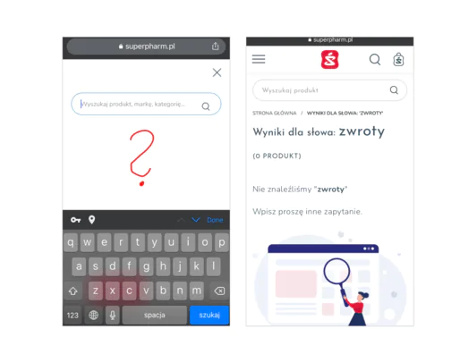
SuperPharm: No autosuggestion of popular queries or popular products and returning empty results.
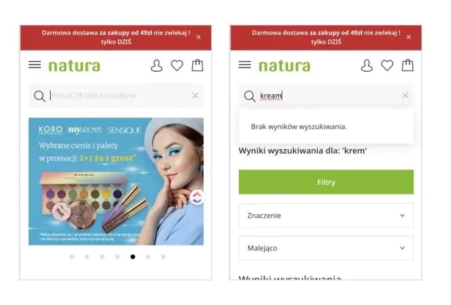
Drogeria Natura: No auto-suggestion and spelling mistakes — just one wrong character within the search term and we will get no search results.
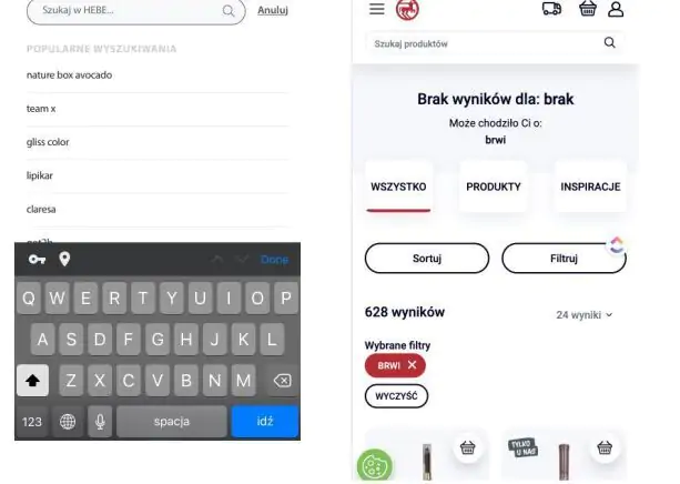
Good practices of search engine operation in ecommerce: autosuggestion in the search window (Hebe.pl) and suggestions in the absence of search results (Rossmann.pl).
- Filtering and sorting
These functionalities are particularly relevant for a large range of products and significantly improve shopping and user experience. However, in order for them to fulfill their task, they must work well and take into account the specifics of the products sold. Unfortunately, this is not the norm.
- So that the customer knows that he can sort or filter a long list of products, we must tell him about it. In Drugeria nature, on the other hand, there is no visual designation of filters or sorting. The filter and sorting functionality also reduces page reloading after each selected filter and very poor categorization of filters.

- The filters section is not visually marked, nor is it signed, which can cause difficulties in finding the filtering function. In addition, the absence of checkboxes next to the attributes does not indicate that you need to click on them.
Facilitate the achievement of the goal, that is, making a transaction
The main conversion in the online store is to make a transaction. The user entering the website of an online drugstore is going to buy something (or at least so we can assume), this is also the goal of the owner of the drugstore, hence let's make it easier for the customer.
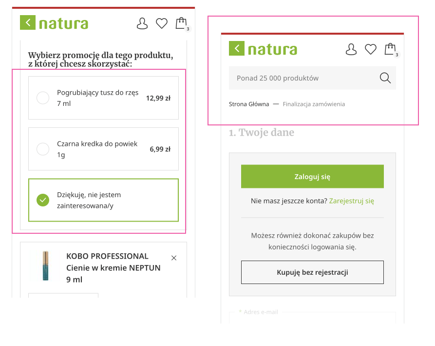
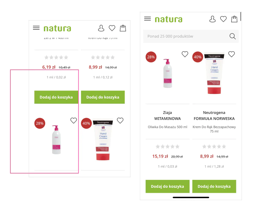
First of all, we should carefully use various kinds of elements that encourage the customer to enlarge the shopping cart. Not only can they distract and annoy, but they can also confuse and make it difficult to understand what next step needs to be taken. Examples of such risky use of this type of “helpers” are presented in the graphic below in the drugstore Natura.
There we see the option to choose a product in the promotion, which is so large and occurs with each product, so reaching the button to go further is very far away, and by the way the customer can get annoyed and have the feeling of intrusive persuasion to make larger purchases. At the same time, during the finalization of the order, you can abandon the search engine so that there is no need to distract the customer, and instead of breadcrumbs it is better to show the individual steps of the cart.
Also, do not force the creation of an account in the store, because we can easily lose that customer who abandons the purchase process (this, of course, does not only apply to online drugstores, but e-commerce in general). People don't want to have to remember their logins and passwords, besides saving their private data can be a concern for them.
As reported by the Nielsen Norman Group, people are concerned that signing up will cause them to receive a lot of spam. On the other hand, in the registration form, for those who decide to create an account, do not require too much data (e.g. a separate login or nickname, which can be an email address, or date of birth).
Also show how many steps there are and what will be in the next step. This, for example, was missing in Alkma, where the user has yet to make a payment and receives the information that the order has already been accepted. The user may feel that everything has been done, and yet he is still waiting to pay for the order.
Trends in improving the customer experience in the beauty industry
For many consumers, buying cosmetics via the Internet is still difficult to imagine. They need to talk to the seller, ask about the action, smell, check the consistency. That is why the beauty industry is one of the most powerful uses of modern technologies and testing solutions that we would not even think about. It is worth being open to them and checking solutions that can improve the customer experience during the shopping process.
- Extended search options
Image Search (visual search) we have known for a long time, but still few Polish eCommerce companies allow this option. On the other hand, this significantly reduces the time it takes for a customer to find a specific product, especially if he sees a cosmetic at a friend's and quickly wants to check if it is in his favorite drugstore.
- Virtual testers
You may associate these options with clothing stores, but why not implement it in online drugstores? After all, the questions to which clients need answers are many: Which lipstick color to choose? Will this shade of eyeshadow match the color of my eyes? Artificial Intelligence (AI) and Augmented Reality (VR) will help to answer them, allowing “virtual fitting” and simply checking the cosmetic on your own face. The question arises: is it an investment worth considering? I think so, because 61% of consumers say they prefer to shop at retailers that offer the possibilities offered by augmented reality.
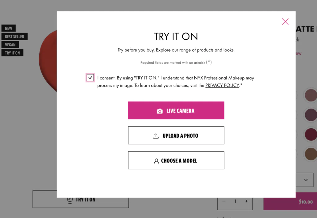

- “Virtual fitting”, that is, checking the color of lipstick on your face or the chosen model. You can also correct the automatically selected area of the lips if it is too small or too large- nyxcosmetics.com.
- Inclusiveness, that is, openness to everyone
What is inclusivity in the beauty industry? It's celebrating our difference and taking into account all skin tones, skin types, and simply each and every one of us. It is also the absence of a division into cosmetics for women and men and the use in communication of human diversity, which more reflects real life, and not the instagram one with the filter applied. And this is increasingly required by a young client. He wants transparency, he wants respect for everyone, he no longer wants to pretend and chase unrealistic demands of the world and of himself.
Marketing is important, but in combination with UX it can really bring many times better results. It is worth starting to put more emphasis on improving the customer experience in online drugstores, because together with the use of the opportunities offered by modern technology we can further accelerate the development of this e-commerce segment. Where to start? Best of all, from the analysis of the current situation, that is, a UX audit that takes into account not only the interaction with the store, but with the entire purchasing process.
- Utilization machine learning (ML), that is, machine learning in search also influences the improvement of the experience by personalizing search results and product recommendations. In combination with NLP (Natural Language Processing) You can display products that are in line with users' intentions, without having to search for exact product names or categories.
Include analytics and real user testing to get an even more complete picture of what can be optimized or changed. The key to success is understanding the customer and building a sense of security that is worth any price.
Read about UX
See other articles that may also be of interest to you


.png)


![This is what you need to know to make your medtech business work [+UX examples]](https://cdn.prod.website-files.com/665f016b950e89499f580acc/671b831663a2597f47c963f3_Grafika-nr-1_-tytul_-Innowacja-termometra--scaled.webp)


