Fundacja K.I.D.S – How do you design a website for a parent who has just been told their child needs to be hospitalized?
Not every project starts with the question, "How will we make money from this?" Sometimes, the starting point is entirely different: how can we help a parent who has just been told their child needs to be hospitalized find the information they need faster—and ease some of the stress that comes with it?
This question became the foundation of Szpitale dla Dzieci – a platform created by Fundacji K.I.D.S., to support parents and caregivers before their child's hospital stay. At ZIMA UX,UI & Design Strategy we had the pleasure of designing and developing the website that serves as the heart of this initiative.
Designing for users when there is no room for design mistakes
Designing digital products often revolves around optimizing processes or increasing conversions. In this project, the process was important – but the person using the platform, and the emotional state they were in, mattered even more.
Parents looking for a children's hospital are rarely in a comfortable situation. They are dealing with uncertainty, anxiety, and countless questions, often without the time or emotional capacity to search for answers across multiple websites. This understanding shaped every design decision we made. The interface had to be as simple, predictable, and cognitively effortless as possible.
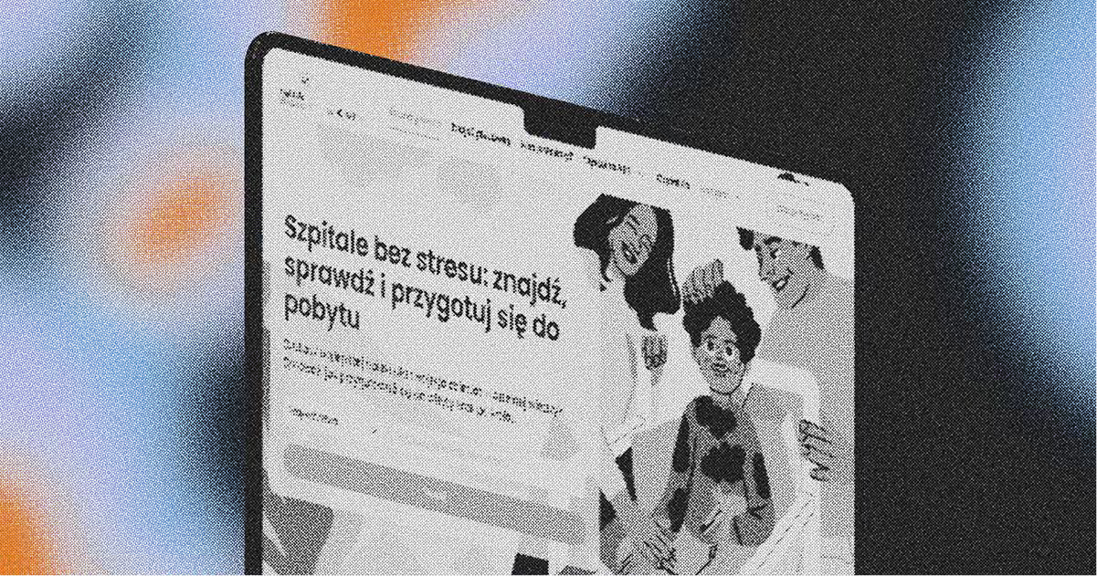
We designed a platform that enables parents to quickly find the right medical facility, review its details, and access practical information needed before an appointment or hospital stay. The experience guides users step by step—from searching for a clinic or hospital department to preparing for hospitalization.
The search engine—the most challenging part of the project
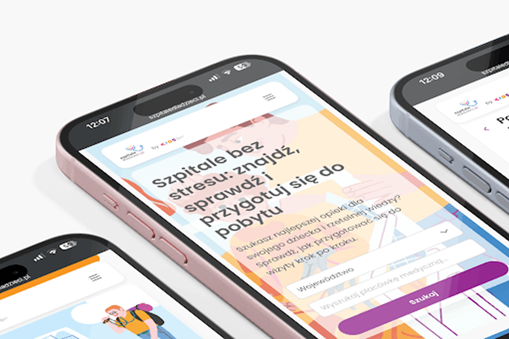
The most important—and at the same time the most challenging element of the platform to design — was the advanced search engine for medical facilities.
The starting point was a question that sounds simple, but in practice determined the entire search architecture: what does a parent actually know at the moment they arrive on the website?
Usually, they do not know the name of the hospital—they have a referral with the name of a clinic or hospital department. That is why the search engine works based on this information: the user enters the name from the document they are holding, and does not need to know the name of the medical facility to which that department belongs. An additional filter is the province, which is important because the database includes hundreds of clinics and hospital departments, as well as dozens of children's hospitals from across Poland.
We designed the entire user journey around three simple steps:
- Enter the name of the clinic or hospital department.
- Browse the list of matching medical facilities.
- Choose the one that best matches your situation and view its detailed page.
Not a single step more.
In this context, every additional field or unclear filter creates a real cognitive burden—and at that moment, a parent has the least capacity to bear it.
From a UX perspective, this meant one thing: designing the journey around what the user is actually looking for—the medical facility, rather than around how the data is organized in the Foundation's database. The entire process reflects the real journey of the patient and their caregiver—from the moment they receive the referral to finding the right medical facility and preparing for hospitalization.
Consistency that builds trust.
With such an extensive platform—featuring hundreds of medical facility pages, an educational section, children's stories, podcasts, and downloadable documents—it would have been easy for visual inconsistencies to emerge. The second major challenge was therefore maintaining a consistent colour palette and a unified visual language throughout the entire website, regardless of whether the user was viewing a hospital page, reading an article in the Reading Room, or moving on to a story about Wilk Emocjusz.
This is not about aesthetics for the sake of aesthetics. We designed a calm, muted colour palette that is consistent with the Foundation's visual identity. In a medical context and during an emotionally difficult situation, this kind of consistency builds the feeling that the platform is trustworthy and well thought out—and this directly translates into trust in the information available on it.
This is a good example of the fact that UX is not about adding impressive animations—it is about removing obstacles and building consistency where users need it most.
Education as part of the experience.
The platform does not end with finding hospitals. In the Hospital ABC section, parents can find a downloadable checklist of items needed for a hospital stay—separate lists for the child and the caregiver, including even small items such as a marker for labeling food in the shared ward refrigerator.
There is a Children's Patient Rights Charter, stories about Wilk Emocjusz that help children become familiar with staying in hospital, and the Pacjenciaki podcast, which provides knowledge for parents in an accessible format.
Thanks to this, the platform supports parents not only in finding the right medical facility, but also in preparing for the entire hospitalization process. It is about designing the experience in a broader sense —not only „find", but also „understand", „prepare" and „feel more at ease.".
Why it matters
The Hospitals for Children platform is a project in which good UX has a direct impact on how parents experience one of the most difficult moments in their lives. User-friendly navigation, a simple search engine, and a consistent, well-organized interface are not an addition here—they are essential for the platform to fulfill its purpose. The project was delivered pro bono for Fundacji K.I.D.S. in collaboration with the Foundation's Vice President of the Management Board, Paweł Bielski, and graphic designer Justyna Ziębiec.
We are pleased that we were able to use our experience in designing digital products to support an initiative of such great social importance. We believe that well-designed UX can influence not only the ease of using a website, but also users' sense of security, trust, and comfort.

Read about UX
See other articles that may also be of interest to you
.png)
.png)
.png)
.png)
.png)
.png)





![This is what you need to know to make your medtech business work [+UX examples]](https://cdn.prod.website-files.com/665f016b950e89499f580acc/6a43a79743af9d4fe4319261_ToMusiszWiedziecZeby....png)